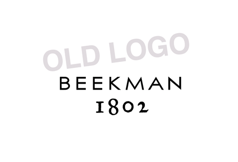
A little inside Beekman scoop: Do you have a little pesky mistake that has been bothering you for years, but you just never seem to get around to fixing it? There's one that's been bugging Josh ever since Day 1 of Beekman 1802:
Our logo.
Well, at least part of it. The "1802" part.
You see, when we first started our little farm business, we were under a lot of pressure. It was the worst recession since the Great Depression, we'd both recently lost our jobs, Josh was commuting back and forth to NYC doing freelance, and we were our only employees.
So Josh had about two hours during a train ride to design and create our logo. He spent a decent amount of that ride creating unique individual letterforms for the word "Beekman." But the train was pulling into the station when it came time to add the "1802." Originally, we wanted to recreate the "1802" that appears on this 1802 Farmers Almanack. William Beekman probably even had a copy of this Almanack in his home.
But Josh was late to a meeting, so he hurriedly found an existing typeface that was sorta-kinda-almost like it, and quickly typed it out.
Back then we didn't ever dream that 11 years later it would be on millions of bars of soap and other products around the world. And each one bugs Josh just a little bit more.
So we finally got around to hand-recreating the "1802" to match the old Almanack. Finally, it's completely unique to us. Over the next year you'll see it start appearing on our products.


Yes, we know it's not a huge difference. Pretty minuscule to a non-graphic design professional. You probably wouldn't have even noticed. But if we've learned anything over the last 11 years, it's that paying attention to every little detail, fixing every mistake, and being 100% authentically us are big parts of our success.
Plus, Josh can finally unwrap a bar of our own soap in the shower without a single regret.
Priceless.
